To Mat or Not Mat?
When choosing a custom frame, one of the first design questions is often surprisingly simple: Should the artwork have a mat?
A mat can create breathing room around an artwork, give a smaller piece greater presence, introduce color or texture, and help separate certain works from the glazing. But not every piece benefits from one—and when a mat is appropriate, there are many more possibilities than the familiar white border surrounding a photograph.
At Harlem Frames, we work with conservation mat boards, museum boards, and specialty mat boards, allowing the matting to respond to both the visual character of the artwork and its preservation needs.
So, when should you mat an artwork, when should you skip it, and what kind of mat should you choose?

What Does a Mat Actually Do?
A mat is the border placed between an artwork and its surrounding frame.
Its most obvious role is visual. Matting creates negative space around an image, establishing a transition between the artwork and the frame. Depending on its proportion, color, and material, that space can make a presentation feel quiet and restrained—or become an expressive part of the framing design itself.
For many works on paper, matting can also serve a practical purpose by helping create separation between the artwork and the glazing. The mat therefore shouldn't be considered an afterthought. Its material, proportions, color, surface, and relationship to the artwork all contribute to the finished frame.

When Does an Artwork Benefit From a Mat?
Matting is particularly common for photographs, prints, drawings, watercolors, works on paper, documents, and other relatively flat pieces.
It can be especially effective when the artwork needs visual breathing room. A small drawing placed immediately against a substantial frame, for example, may feel overwhelmed. Surrounding it with a carefully proportioned mat gives the eye space to transition from the frame to the artwork and can give an intimate piece considerably more presence.
Larger works can benefit from matting as well. The important consideration isn't simply size, but balance.
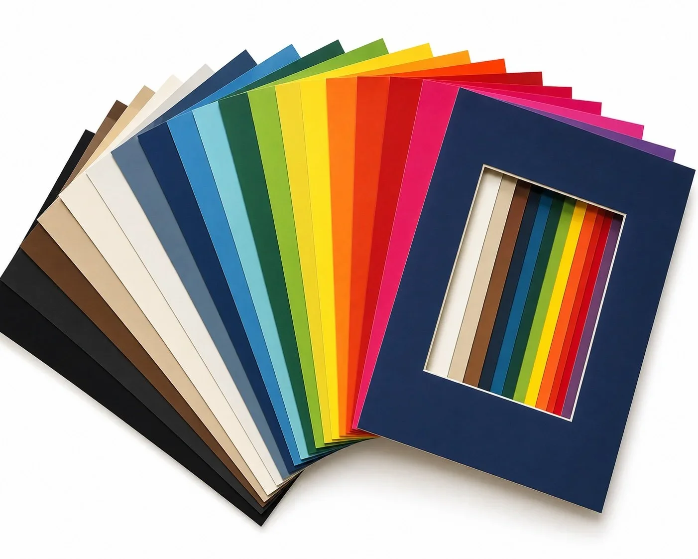
Conservation Mat Boards
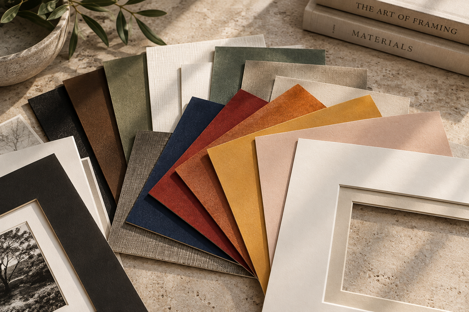
For many framing projects, Harlem Frames offers conservation-quality alpha-cellulose mat boards in an extensive range of contemporary colors, cores, and thicknesses. This means conservation-minded framing doesn't have to limit the design to white or cream.
A neutral mat can create a subtle transition around an artwork, while blues, greens, reds, yellows, and other colors can establish an entirely different relationship between the image and frame. The range of colors also allows the framer to respond to subtle elements within the artwork without simply matching its most obvious color.
And because different cores and thicknesses are available, even the beveled edge visible around the mat opening can become part of the finished presentation.
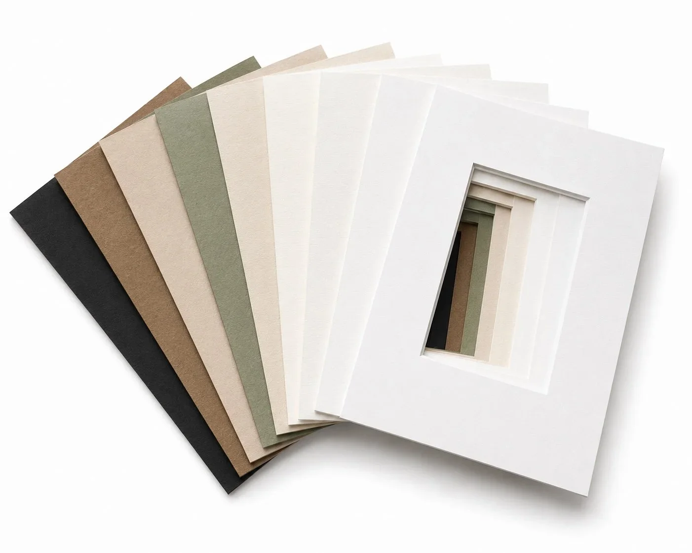
Museum Boards
For projects where preservation is a particularly important consideration, museum-quality mat board provides another option. The museum boards available through Harlem Frames are made from 100% virgin cotton with a solid core throughout and are available in buffered as well as selected unbuffered options.
These boards tend to have a quieter, more restrained palette than the extensive range available in conservation mat boards—and that's often appropriate. For original works on paper, historic material, photographs, valuable prints, or other sensitive pieces, the material surrounding the artwork can be just as important as the visible design.
Whether buffered or unbuffered material is appropriate depends on the artwork itself. This is one reason conservation framing should be considered according to the individual object rather than approached with a single formula.
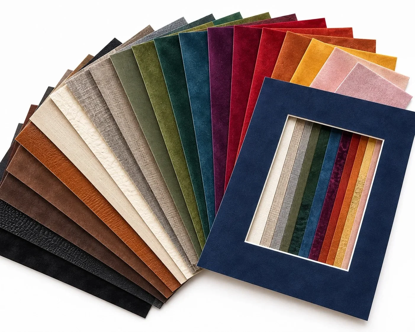
Specialty Mat Boards
Matting can also become a much more expressive design element. Harlem Frames offers specialty conservation-quality mat boards distinguished by rich colors, refined textures, and premium surfaces. These can introduce a tactile quality that a traditional smooth mat doesn't provide.
Textured neutrals can create warmth around an artwork, while deep greens, blues, burgundies, ochres, and other saturated surfaces can make the mat a deliberate part of the composition. Depending on the artwork, specialty finishes can also establish an interesting dialogue with textiles, photography, decorative works, or pieces with strong material qualities of their own.
The goal isn't to make the mat compete with the artwork. It's to find a surface that adds something meaningful to its presentation.
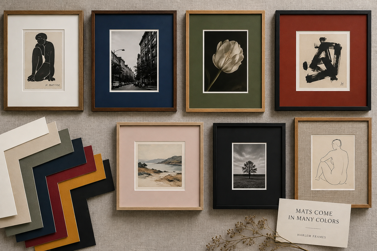
Does a Mat Have to Be White?
Not at all.
White and off-white remain popular because they're versatile and allow the artwork to command attention, but they're only a small part of what is possible. Even among neutrals, subtle differences matter. A bright white can feel crisp and contemporary, while warmer whites, creams, taupes, and natural tones can soften the transition between artwork and frame.
Color can be equally sophisticated when used thoughtfully. Instead of asking, “Which color matches the artwork?” consider:
Which color changes the way I experience the artwork?
Sometimes the right answer is white. Sometimes it's charcoal, deep blue, warm linen, or an unexpected color pulled from a minor detail within the piece.
How Wide Should the Mat Be?
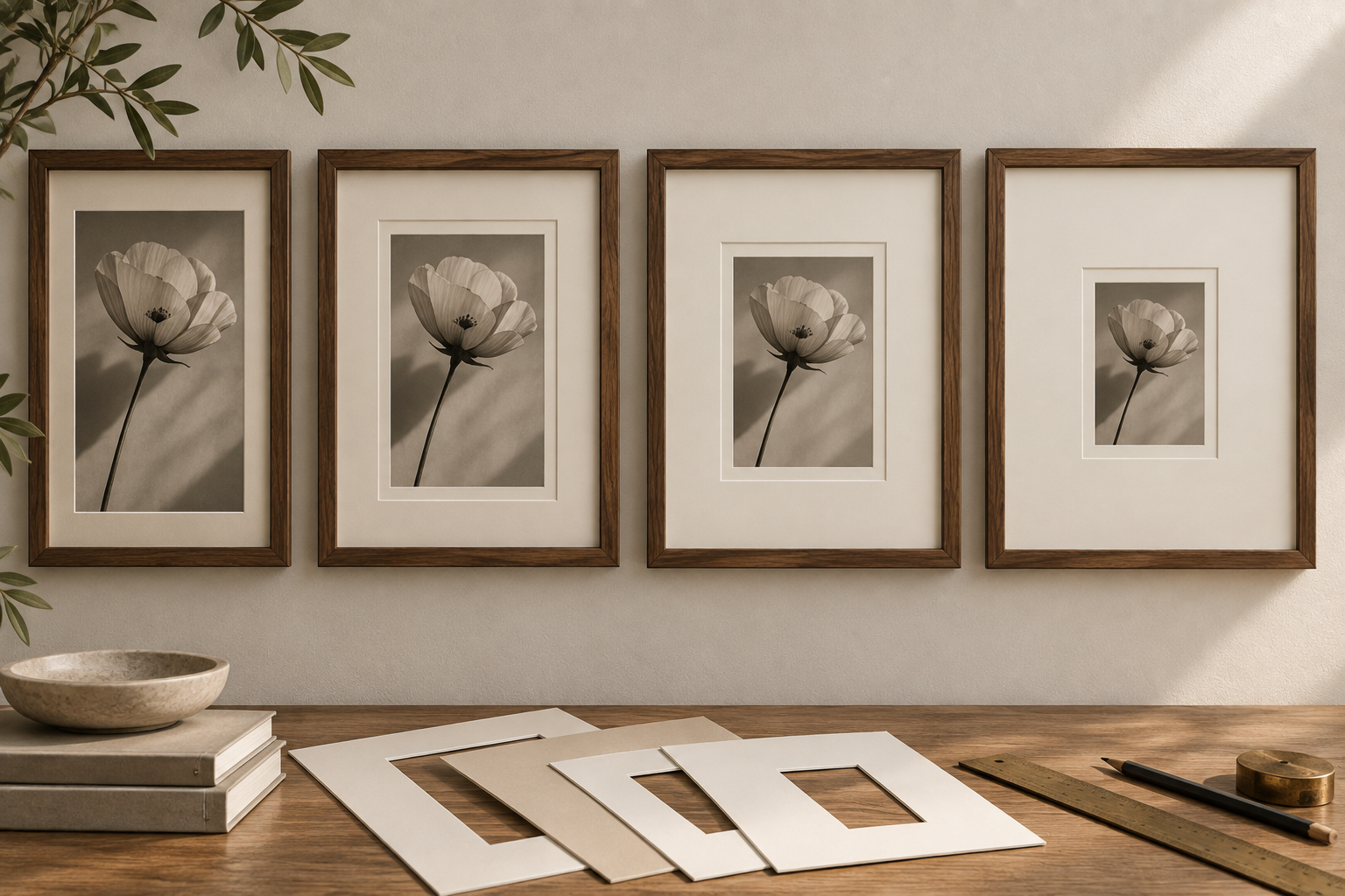
There isn't a standard width that's correct for every artwork. The size of the piece, dimensions of the frame, scale of the finished presentation, and visual weight of both the artwork and moulding should all be considered.
A narrow mat creates a tighter relationship between artwork and frame. A generous mat can make the presentation feel more spacious and gallery-like. Small artworks can sometimes look particularly beautiful with unexpectedly generous matting, giving an intimate piece considerably more presence on a wall.
The goal is proportion—not following an arbitrary measurement.
What About Float Mounting?
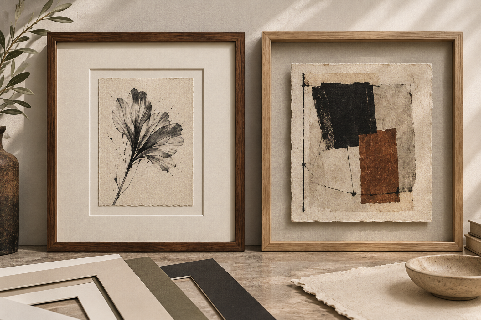
Matting doesn't necessarily mean cutting a window that overlaps the edges of an artwork.
With a float-mounted presentation, the artwork can be positioned so its edges remain visible against the surrounding mat board. This can be especially effective for handmade paper, deckled edges, prints, drawings, and other works where the physical characteristics of the paper are part of the artwork itself.
Instead of concealing those details beneath the mat opening, floating makes them visible. The surrounding mat still provides visual space, but the result can feel distinctly more contemporary.
When Should You Skip the Mat?
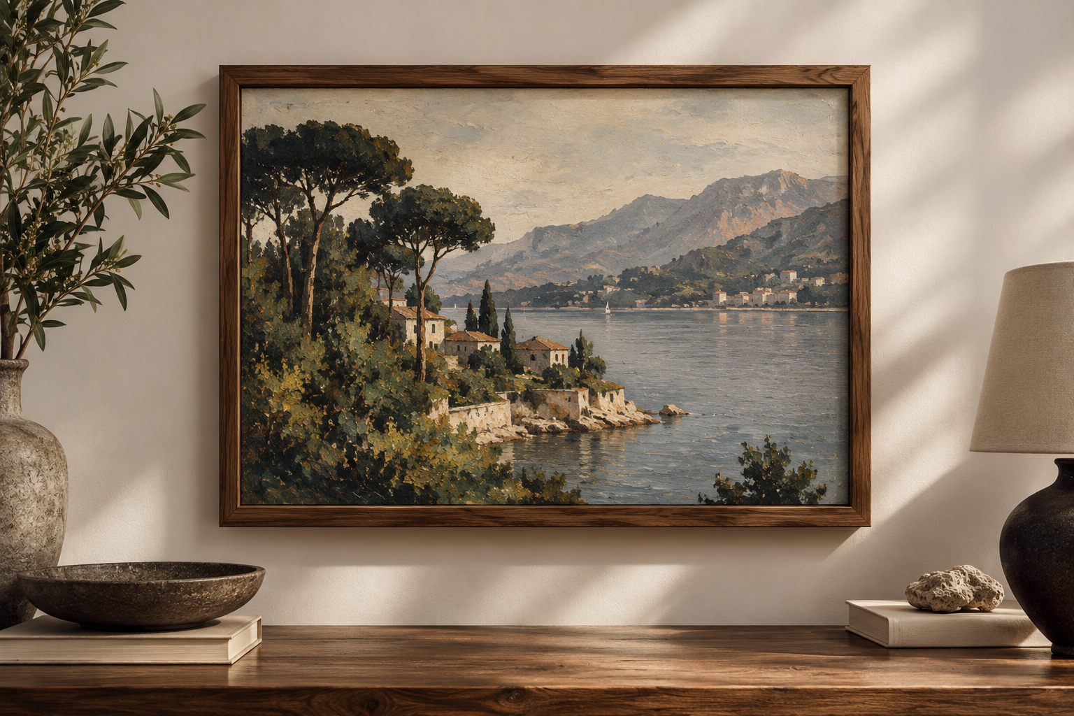
Some artwork simply looks stronger without one.
Canvases, large posters, certain photographs, contemporary prints, and dimensional works may call for entirely different framing approaches. Canvas paintings, for example, can be presented in float frames, where a narrow space between the canvas and frame creates separation without using a traditional mat.
Other glazed works can use spacers to maintain physical separation between the artwork and glazing while keeping the mat visually absent. Choosing not to use a mat doesn't mean preservation or design has been ignored. It simply means another framing solution is better suited to the artwork.
Matting Is Also a Conservation Decision
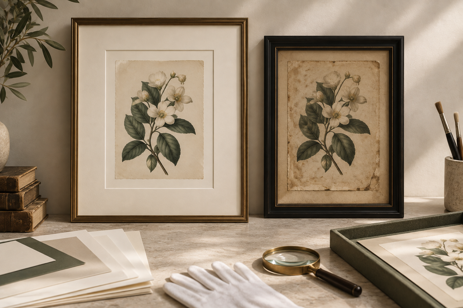
When framing an original, valuable, sentimental, or irreplaceable artwork, what you can't see can be just as important as what you can. Materials immediately surrounding an artwork can influence its long-term condition. This is why conservation-quality and museum-quality boards are available alongside purely aesthetic considerations such as color and texture. The artwork's medium, age, condition, and sensitivity should help determine which materials are appropriate.
Good framing should consider both questions:
How should this artwork look today?
and
How should it be protected for the future?
So, To Mat or Not to Mat?
There isn't one answer.
A mat can give an artwork room to breathe, establish proportion, introduce color or texture, create separation from glazing, and become an important element of the overall framing design. Another piece may look strongest with no visible mat whatsoever. And if matting is appropriate, the next question becomes what kind.
At Harlem Frames, customers can explore conservation mat boards in an extensive range of colors, cores, and thicknesses; 100% virgin cotton museum boards; and conservation-quality specialty boards with richer colors, textures, and premium surfaces.
The decision ultimately begins with the artwork.
Bring your piece to Harlem Frames and compare mat colors, materials, textures, proportions, and framing combinations in person. Together, we can find the presentation that feels right for the work—and appropriate for its long-term care.